What is a CTA?
Have you ever clicked on the subscribe button, or purchased something online that said, “Buy Now?” Then chances are, you have already been in contact with a “call-to-action.”
A call-to-action (CTA) is a piece of content such as, an image or text, that prompts your visitors to “take an action” on your page.
When visitors get on your webpage, they are looking for something to get their attention. Without any actions for them to take, they will simply leave your site and forget about it! That’s the last thing any company wants for their visitors. It’s important to get your visitors to perform an action that will get you in touch with them, provide them with valuable information, receive their contact details, get them to purchase something, or even go onto another page.
When visitors get on your webpage, they are looking for something to get their attention.
What makes a successful and effective cta?
Always make your motive and message clear. Most websites are very vague and don’t get straight to the point. This causes some cognitive bias and when things don’t come easy to people, they tend to disregard it altogether.
To prevent this, make your CTA as clear as possible, making sure you allude to it through great and precise copy.
Great copy creates a clear value proposition. The viewer should be aware of exactly what they are doing, and what the CTA is trying to accomplish. Make sure that it is visually appealing. Don’t forget to add a sense of urgency to provide the fear of missing out.
This also means to utilize the acronym, “K.I.S.S.,” or Keep It Simple Stupid. Don’t overcrowd your CTA, let it be the only thing the viewer can see.
You’ve already read about why you need to place CTA’s “above the fold” in the last blog. The final element for a successful CTA is to utilize specific landing pages that leads them through a sales cycle. Remember to individualize the landing pages to leave it concise, with no other alternative motives to increase conversions.
Easy, Yet Effective Call-to-Action Examples
You’ve probably seen a lot of CTA’s, but let’s look at a few successful CTA’s for your reference.
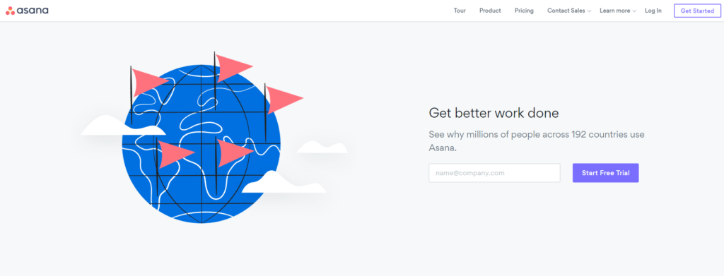
Asana, one of the biggest companies in the world, has a very simple CTA that allows users to get a free trial using two lines of text and an email form.
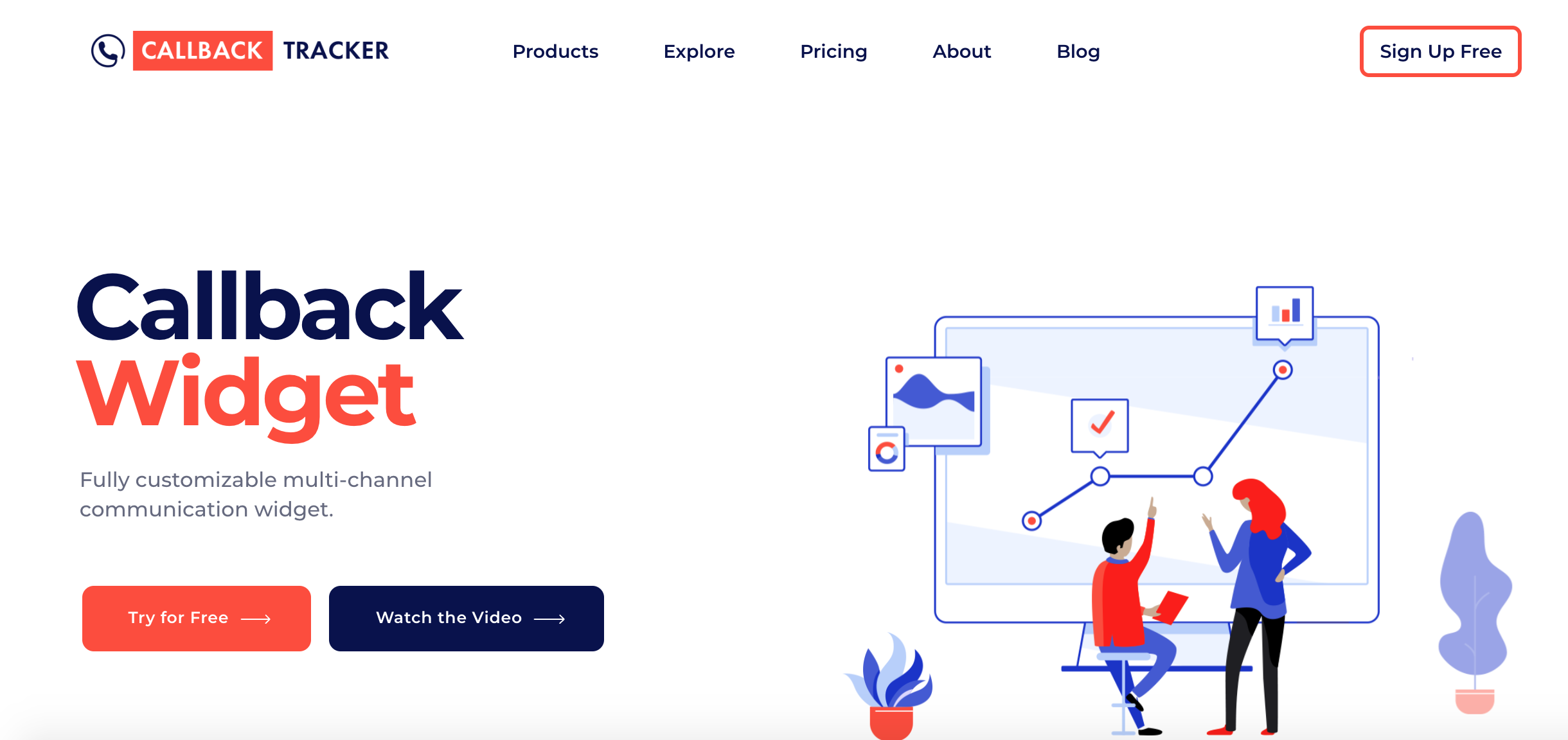
Click to Call Widget can increase
your online leads on 75%
Callback Tracker utilizes a beautiful header and great statistics to get visitors to sign up for a free trial. It’s very effective, and straight to the point! The callback widget itself is a great Call-To-Action, and should be utilized on everyone of your various sites.
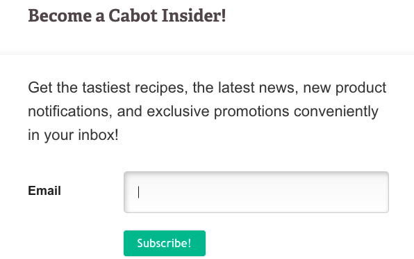
Cabot allows visitors to subscribe to their email promotions by offering a minimal CTA with great copy and a simple button to subscribe.

Netflix is world-renown and has a very effective free month trial. It’s simple and very precise.

A very simple, yet powerful, pop-up by PrintSome to get email subscribers.
Try and mimic some of these to create effective, and high-converting call-to-actions on your pages. If you’re not giving your visitors a purpose, contact will never be made. Convert visitors into customers today by utilizing your own CTA!
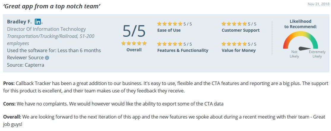
By providing your website visitors with high-converting call-to-actions, you are making sure they will get in contact with you, and increasing the potential of them becoming your customer. A great way to utilize a call-to-action is by implementing a “callback widget” on your site. Callback tracker can increase conversions by 75% using a simple, yet proven effective callback button on your site. Start your free trial and customize the button, logo, and content to your liking to make it specific to your business.
Let us know what you think about increasing conversions through these mediums, and which methods you are applying on your site already!